Mobilunity. Evolution of Logo
The history of logo dates back to 2014. The original name “Mobilunity” was created much earlier and combines the words “mobile” and “unity” into the brand new word reflecting the key concept of the company – flexibility and integrity.
Why Whale?
Though the name itself was loved by the team and had become an essential part of the brand identity, casual customers could sometimes be confused having an association with mobile development or mobile applications. To break through the association it was decided to use the living creature as a mascot. We chose a whale to be ours. Just like a whale swims easily in its natural environment, our company was feeling comfortable and confident in the areas of our expertise. Our whale was cute, friendly and customer-oriented.The icons fountain reflected whole variety of web solutions and services we were offering.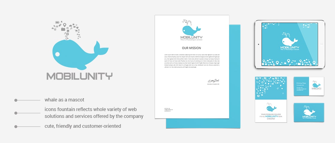
Time passed, we grew and changed…Corporate philosophy stands now on the idea of 5 whales, being the base for the company, our 5 main departments: development, design, infrastructure, customer support, SEO/content. The stylistics had to change a bit to be more sharp and edgy, taking it from technology and development.
Polygonal style was our best choice. Expressive and modern, the style was first used in typography for illustrations mostly, but then it have come successfully into web design fitting well for emphasizing details and making them visually unusual and appealing. It also corresponds with popular material and flat design.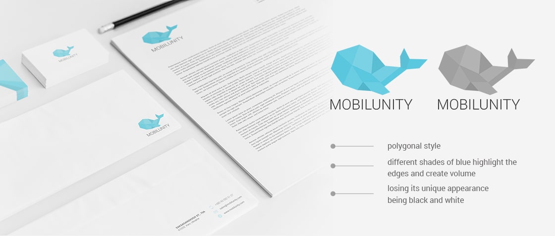
This was one of the ideas of how to design own logo using the polygonal style. Different shades of blue highlight the edges and create volume. While being interesting and eye catching, this version of logo met some complications. Used on printed materials and elements of corporate identity, the logo was losing its unique appearance, nuance tone shades were mixing together showing no volume anymore, especially if made black and white. We decided to improve the logo, for it to fit all sources of visual information.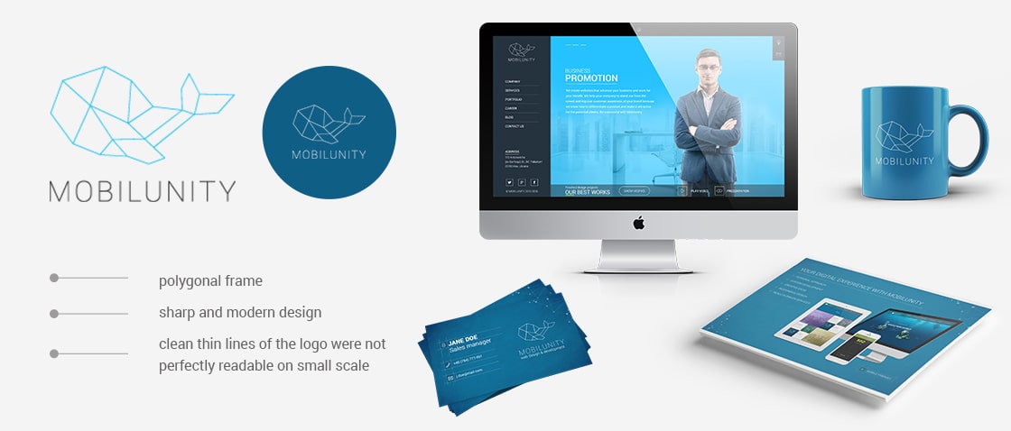
Polygonal frame was used instead of the three-dimensional object. We chose royalty-free Roboto font as our corporate font. Being partially mechanical and geometric, the font fits well the idea ofsharp and modern design of our logo.
2016 Plan
Skeleton style logo was used for quite a while, but then the company started to increase its popularity and came up the need of integrating the logo to all kinds of social media.
Clean thin lines of the logo were not perfectly readable on small scale.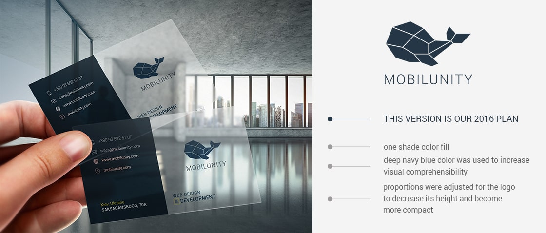
We found a solution in using one shade color fill. We also changed the color for deep navy blue, also regarding the visual comprehensibility issues. The proportions were also adjusted for the logo to decrease its height and become more compact.
In some online and offline materials you may still find variations of our logo. Not only shape but color and even font. This is a credit to our past – of course, it takes a whale (sorry, while! :) ) to renew and update the logo on all resources. We are on it, no doubt.
Every company goes through the process of developing itself, looking for the best options to expand its potential, finding the proper place on the huge modern market. So does logo development process follows accordingly. Our company is growing constantly in its quality and quantity, so we guess it’s not the final version of our logo as well.
